UX Case Study: How Customer Insights Made Requesting Access Easier
If you’ve been keeping up with our UX blogs, you got to learn a bit about our team and what we’re working on, and you saw what it takes to tailor our platform to our customers’ needs. But things are about to get really meaty.
Starting with this blog, we’re taking deep dives into a few of the major initiatives we’ve been working on. From the identification of the opportunity to the outcomes, we’ll walk you through our end-to-end process so you can see how the magic happens, get inspired by what’s next, and learn how we involve our customers every step of the way.
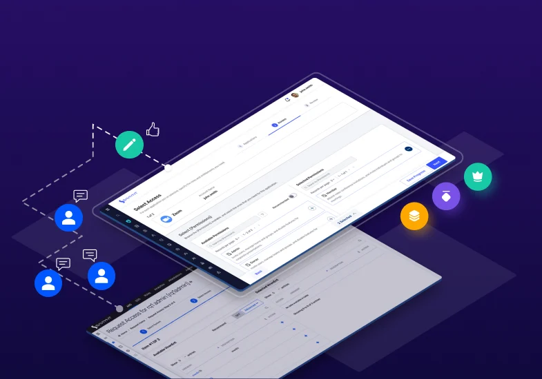
First up is our Access Request System. During this months-long project, we unpacked more than what can fit into this page. But we’re going to do our best because this was the first project of this scale where Saviynt customers co-piloted the UX team to affect some significant enhancements. Pretty ambitious to take on such a heavily used feature in our platform, but it sets the tone for future projects that are just as big—and even bigger.
Opportunity: A Simple Solution That’s Not So Simple
The Access Request features are the bedrock of the Saviynt platform. The capabilities are extremely powerful, and hundreds of our customers have shared their appreciation for how the tool helps them ensure that their identities are properly governed and their companies are secure.
However, our customers have also shared their challenges. Through our feedback channels, one theme reigns supreme: keep it simple. The robust technical capabilities of our Access Request System are great, but too many of them were exposed in the user experience. To our users, requesting access and reviewing those requests should be easy. So when we heard that our customers were challenged with complex interactions, information that wasn’t easy to find, and a process that took too long, we got to work making it better.
Discovery: The Good and the Needs-Improvement
The potential scope of work our Access Request System presents is massive. So, to keep things manageable, we needed to identify the core areas of the feature we aimed to address. To do this, we went straight to the source: our customers.
Armed with data from internal heuristic evaluations and a competitive analysis, we held workshops and interviews with some of our larger, more tenured customers and reviewed the current access request experience end to end. Our only ask: don’t hold anything back. Tell us what you like and what you don’t. Be honest about what helps you and what restricts you.
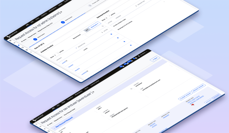
Our customers found that our previous designs lacked visual hierarchy, and the homogenous layout provided little emphasis or content to understand next steps.
Thankfully, we have great relationships with our customers, and they have no problem being honest with us. We were happy to hear that they liked the general design and the flexibility of the options. But we also appreciated hearing that they wanted us to simplify the information on the screens and help them know what to do next. They wanted clarity around what’s required and what’s optional, and they didn’t want unnecessary popups and functions that got in the way of usability. Their enthusiasm started to open our eyes to some simple but significant improvements we could make.
Design Exploration: Putting Customer Insights to Work
After collecting feedback and ideas, we collaborated with our product managers to weigh the requirements against what our customers were telling us so that we could map out achievable designs that addressed our customers’ needs.
Ask any seasoned UXer, and they’ll tell you that this is where reality sets in. Advocating for what our customers need doesn’t eliminate real hurdles like technical limitations, staffing resources and deadlines. Still, we ensured that our customers were part of every decision along the way, and we were transparent about what was achievable now and what needed to be earmarked for a future release. The designs we created addressed three primary objectives:
- Simplify. We stripped down the designs to a clean, uncluttered experience. We scrapped elements that were unnecessary, and we combined as many redundant components as our current technology stack allowed.
- Clarify. We ensured that every screen left nothing to guesswork and that users clearly understood what was expected of them throughout the flows. We layered in a wide variety of tooltips, help text and user-assist messaging to guide users. We also established new interactive elements like expansion carets, toggles, and tabbed wizards to make next steps obvious.
- Expedite. We worked to find every opportunity to improve visual hierarchy and content consistency, eliminate as many complex interactions as possible, and make navigating between steps easy. “Make it easier” may seem like a small request, but it’s a big deal to many of our customers.
Once we had the full set of customer-inspired, redesigned Access Request flows complete, it was time to create the prototypes and get them in front of our customers to make sure we heard them loud and clear.
Validation: Did We Hit the Mark?
To bridge the gap between what we had newly designed and what would actually be built by our developers and engineers, we needed validation from our customers. Will this be a vastly better experience? Do we need to continue iterating to get it right?
To find out, we created prototypes of the new designs and demonstrated them to our customers. Our goal: get as many enthusiastic YESes as possible.
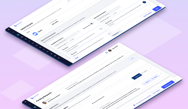
Our new designs offer more room to breathe as well as new iconography and content that establishes stronger context and emphasis for what’s important on the page.
We made adjustments and conducted a broad series of both moderated and self-guided usability tests to make sure our customers’ users would be able to perform Access Request tasks easily and with little guidance.
We’re happy to report that no one failed, and equally important, everyone considered it a much-improved experience. We were able to deliver enhanced, customer-approved designs for the first major UX-driven initiative at Saviynt without a hitch (maybe a few more late-night scrum meetings than we anticipated, but they were worth it).
Outcome: Positive Beta Results Pave the Road Ahead
We expect the full enhanced Access Request experience to be made generally available by the end of 2023, and we’re already seeing impressive results.
- Customers have reported a far simpler and clearer experience when creating and reviewing access requests compared to the previous version of our product.
- The new designs, content and interactive elements we introduced in the Access Request System were well received, positioning us for broader-scale design improvements across other features in the Saviynt platform.
- General feedback from our customers as the Beta releases roll into our product has been overwhelmingly positive—whether they were involved in our exploration workshops or not.
But this is just the beginning.
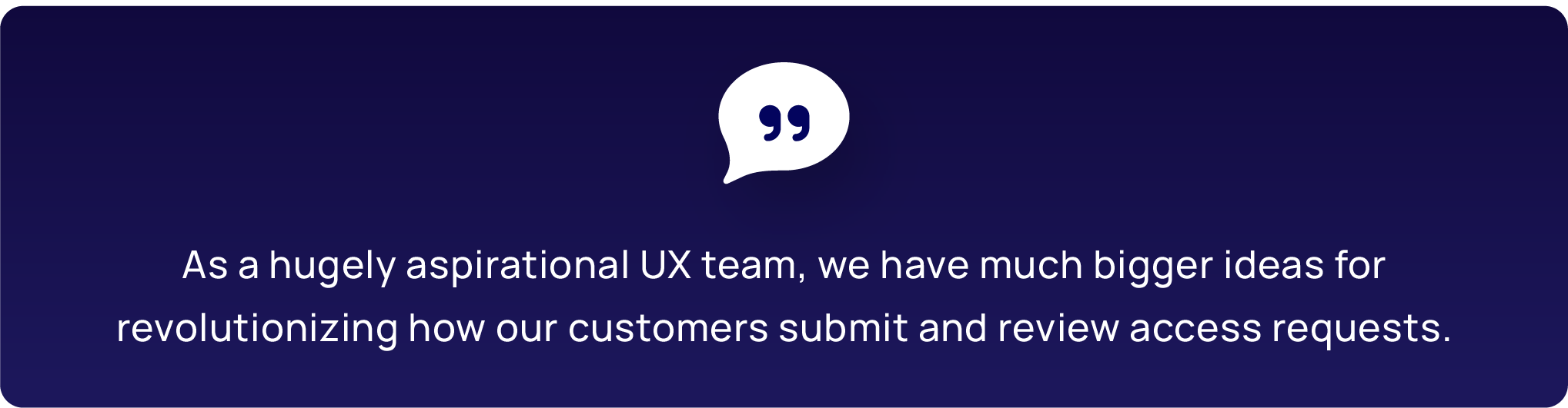
Without trivializing the improvements of this initiative, this was a relatively minor “overhaul” of our existing Access Request System. As a hugely aspirational UX team, we have much bigger ideas for revolutionizing how our customers submit and review access requests. We’re extremely excited that our customers are enjoying the improvements we’ve made, but it only makes us hungrier to take much bolder steps in the near future (hint: requesting access is about to get smarter).
Want to see how we applied what we learned to our Certifications and Privileged Access Management features? Then stay tuned for our next case study blog in January 2024.
Join Our UX Journey
If you want to experience just how customer-obsessed we are, join us. Our small UX team thrives on giving our customers a big voice at Saviynt, and we want you to be part of that conversation as well. To get involved in the workshops, design reviews and usability testing that puts our customers at the center of our products, join our UX Research Panel today. And remember, you can always share your ideas in the Saviynt Ideas Portal where even small ideas can make a big impact.


Report
2024 Identity and Security Trends
Report
Saviynt a Gartner Peer® Insights Customers Choice for IGA
Solution Guide
IGA Buyer's Guide
-1.png)
Solution Guide
PAM Buyers Guide

Whitepaper